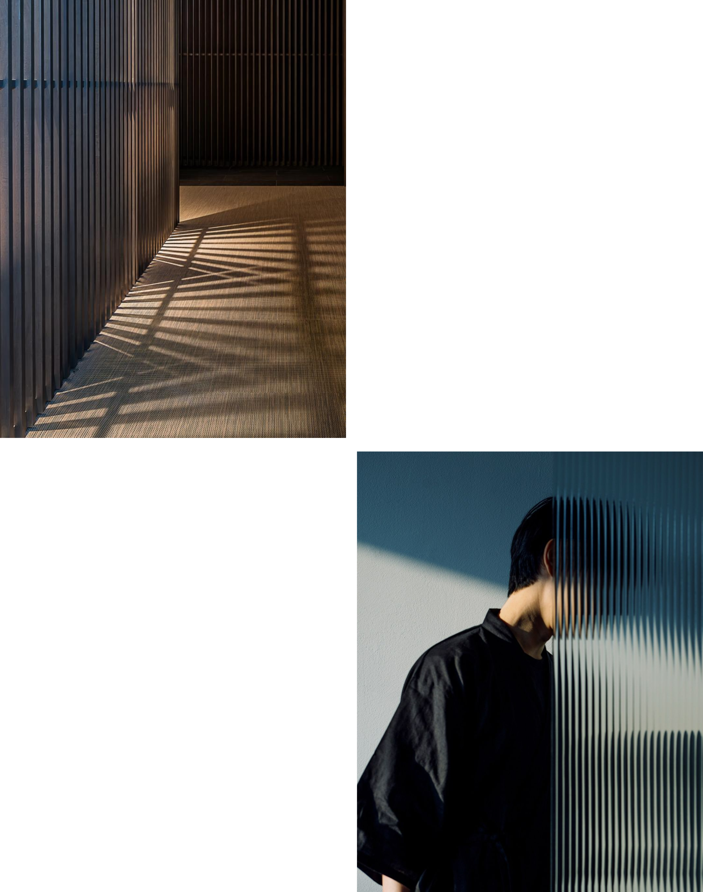
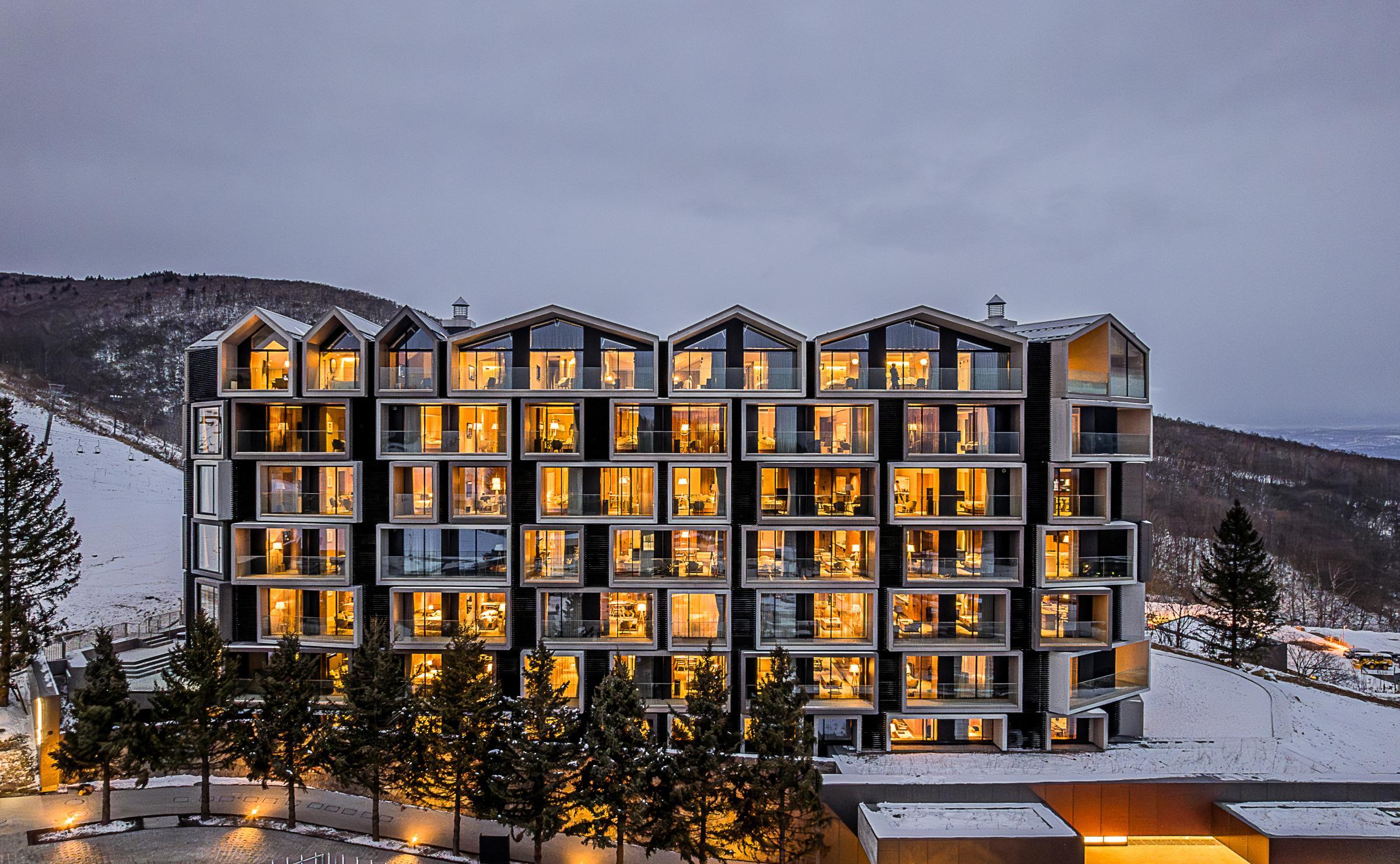
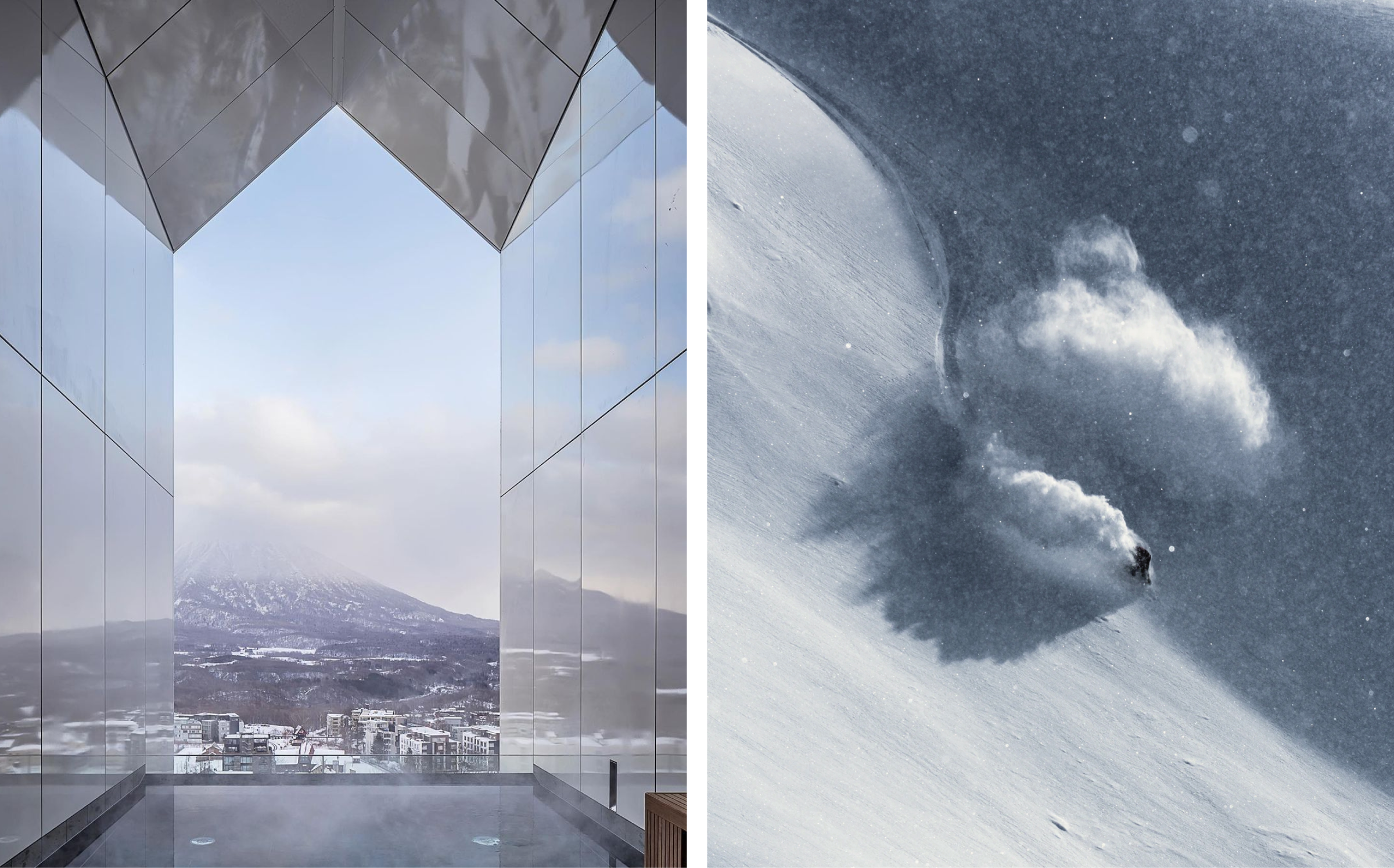
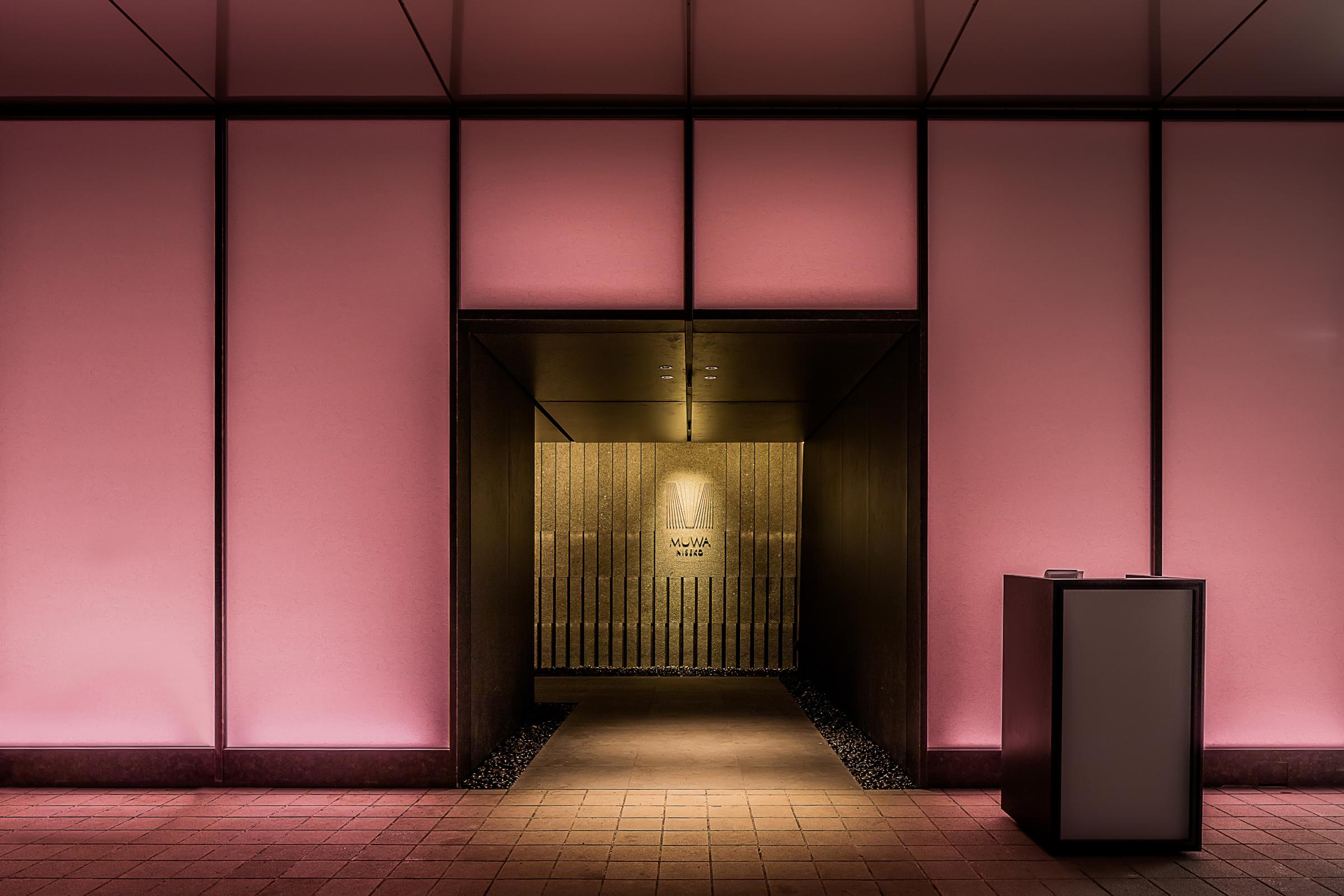
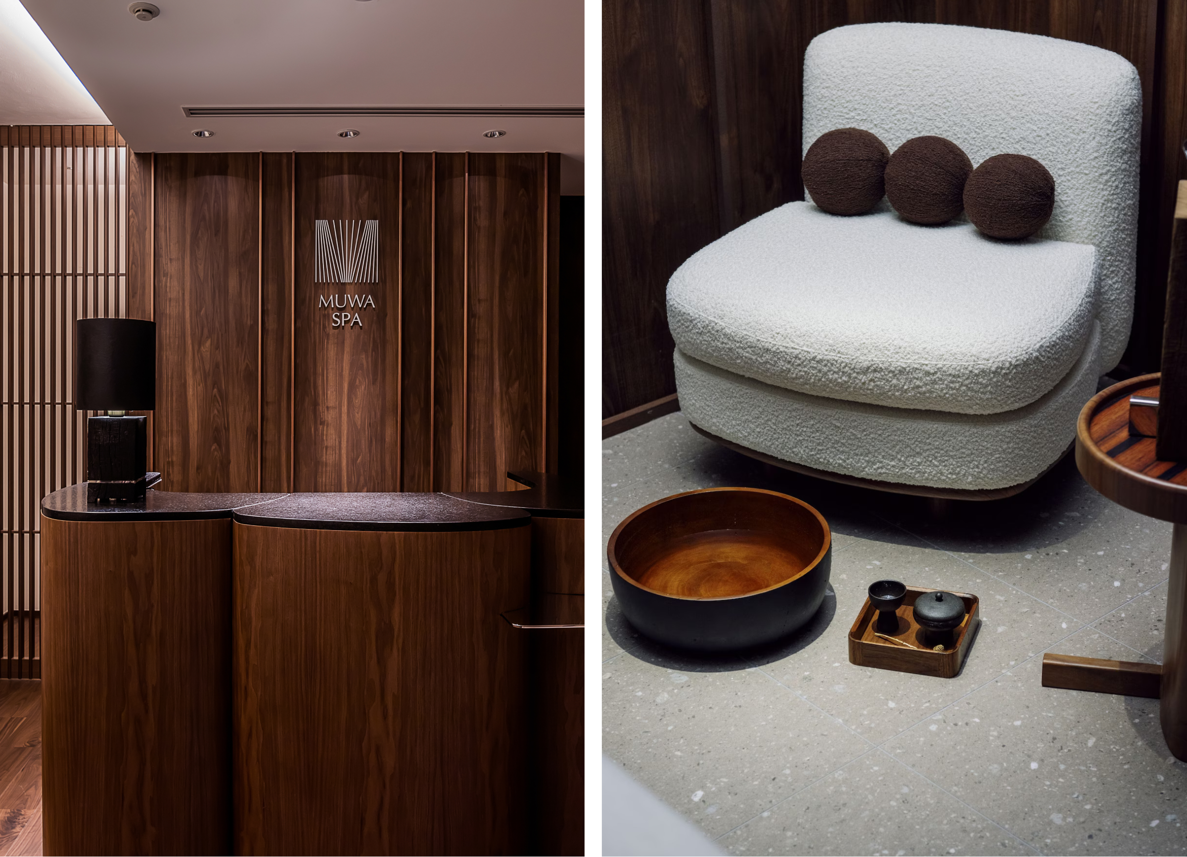
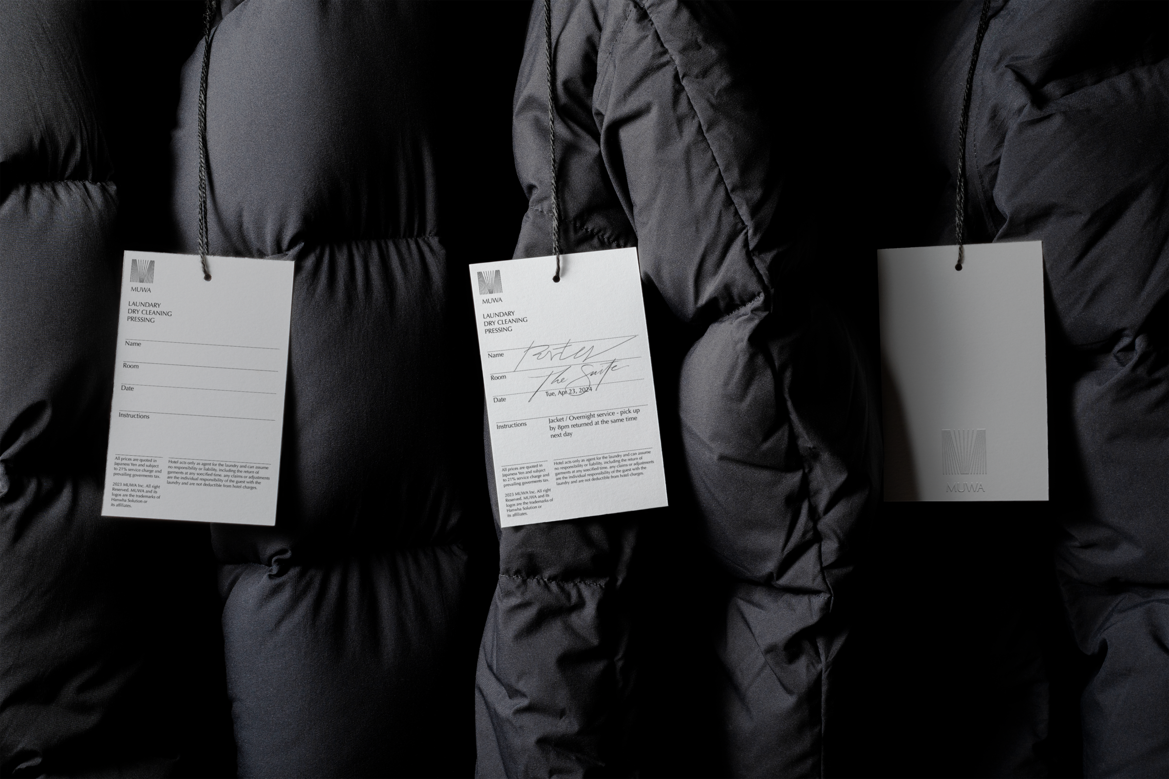
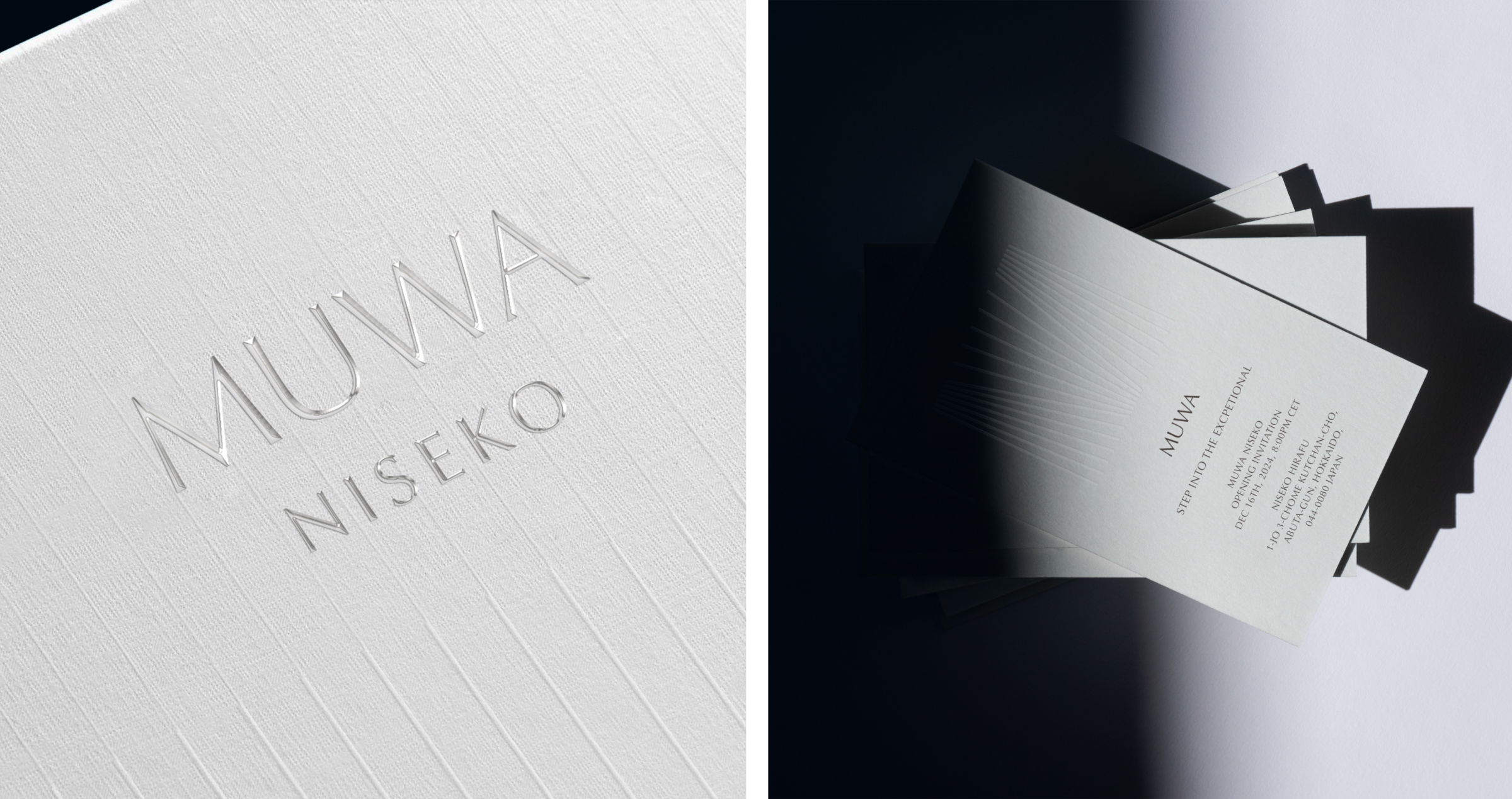
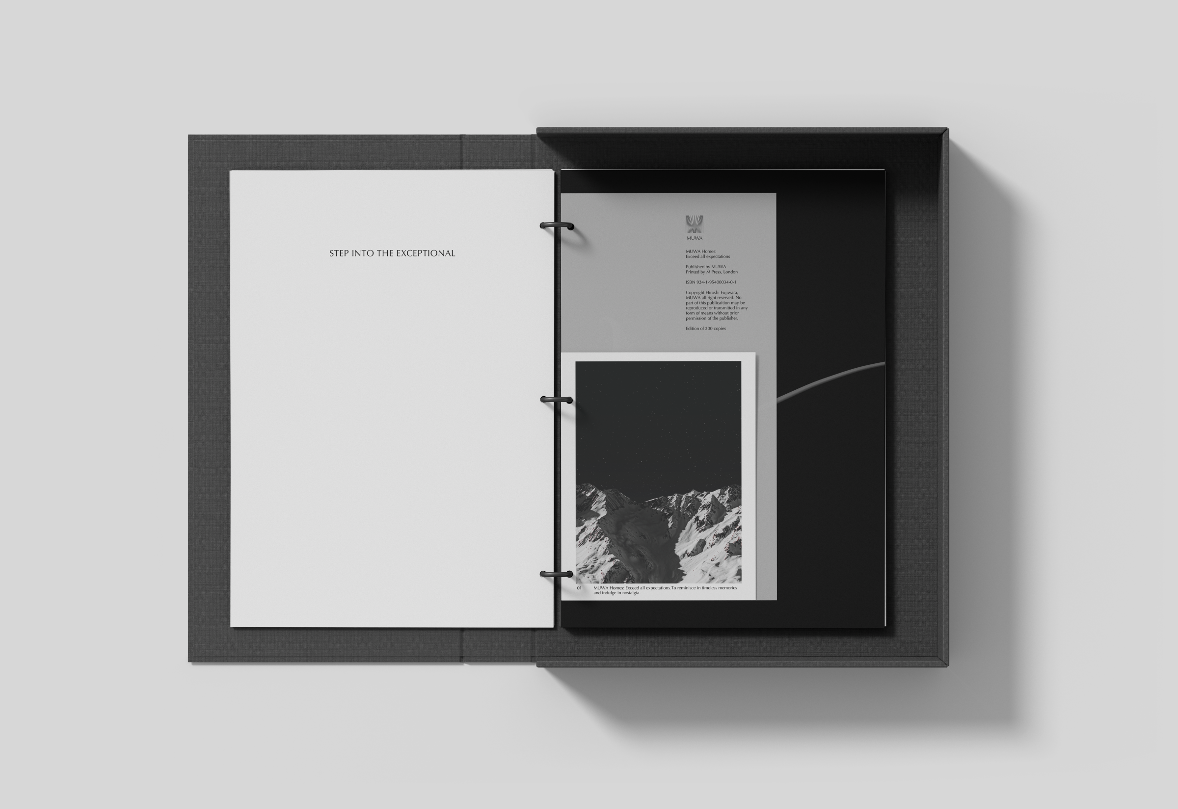
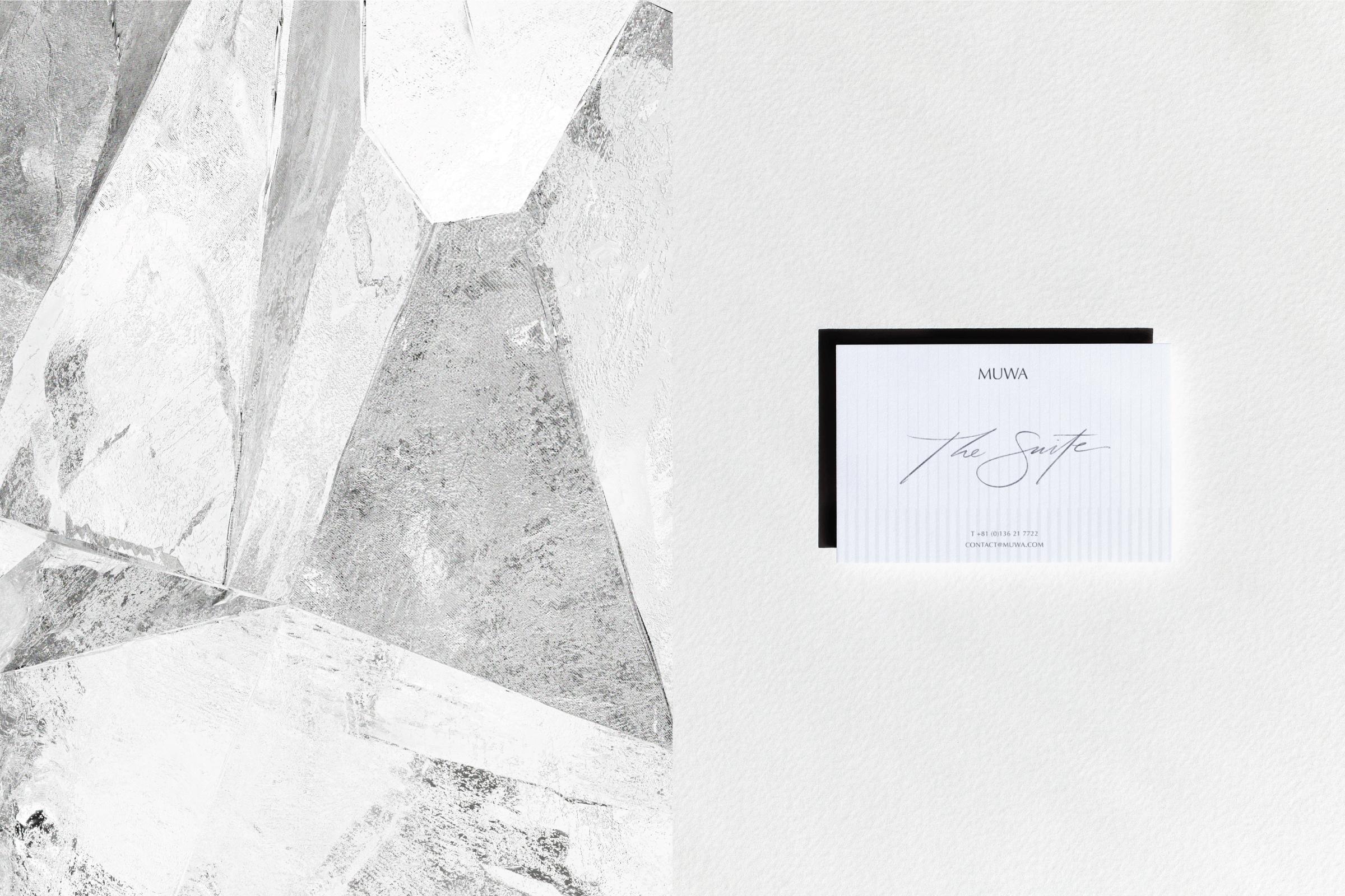
The MUWA brand embodies a sense of calm confidence that stems from the rejuvenating serenity of its natural surroundings, offering a peaceful refuge from the fast-paced city life. The brand's symbol encourages contemplation, with each set of lines representing the interconnectedness between objects, nature, and humans, harmoniously united to embody our emotional and experiential resonance. The lines' varying spaces are intentionally designed to evoke a sense of balance and harmony, reflecting the brand's commitment to creating a tranquil and nurturing environment for its audience.
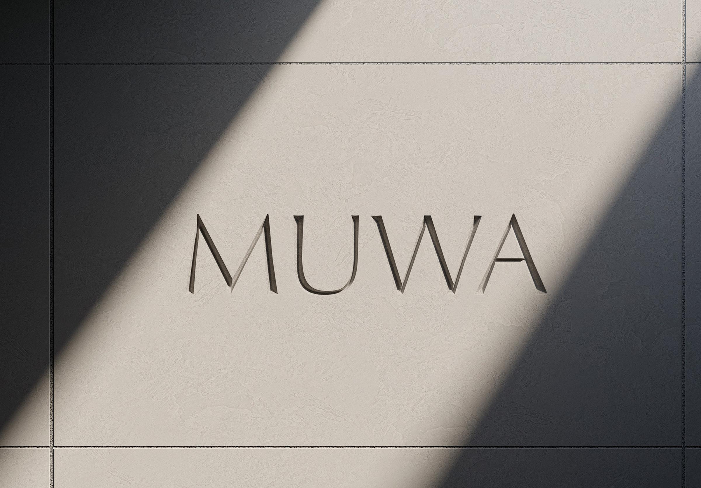
MUWA
Year
- 2022-2023
Client
- Hanwha Solutions
Sector
- Real Estate
- Hospitality & Leisure
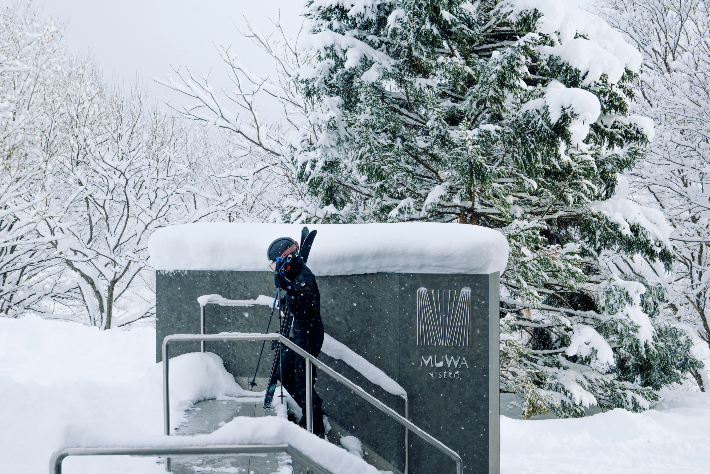
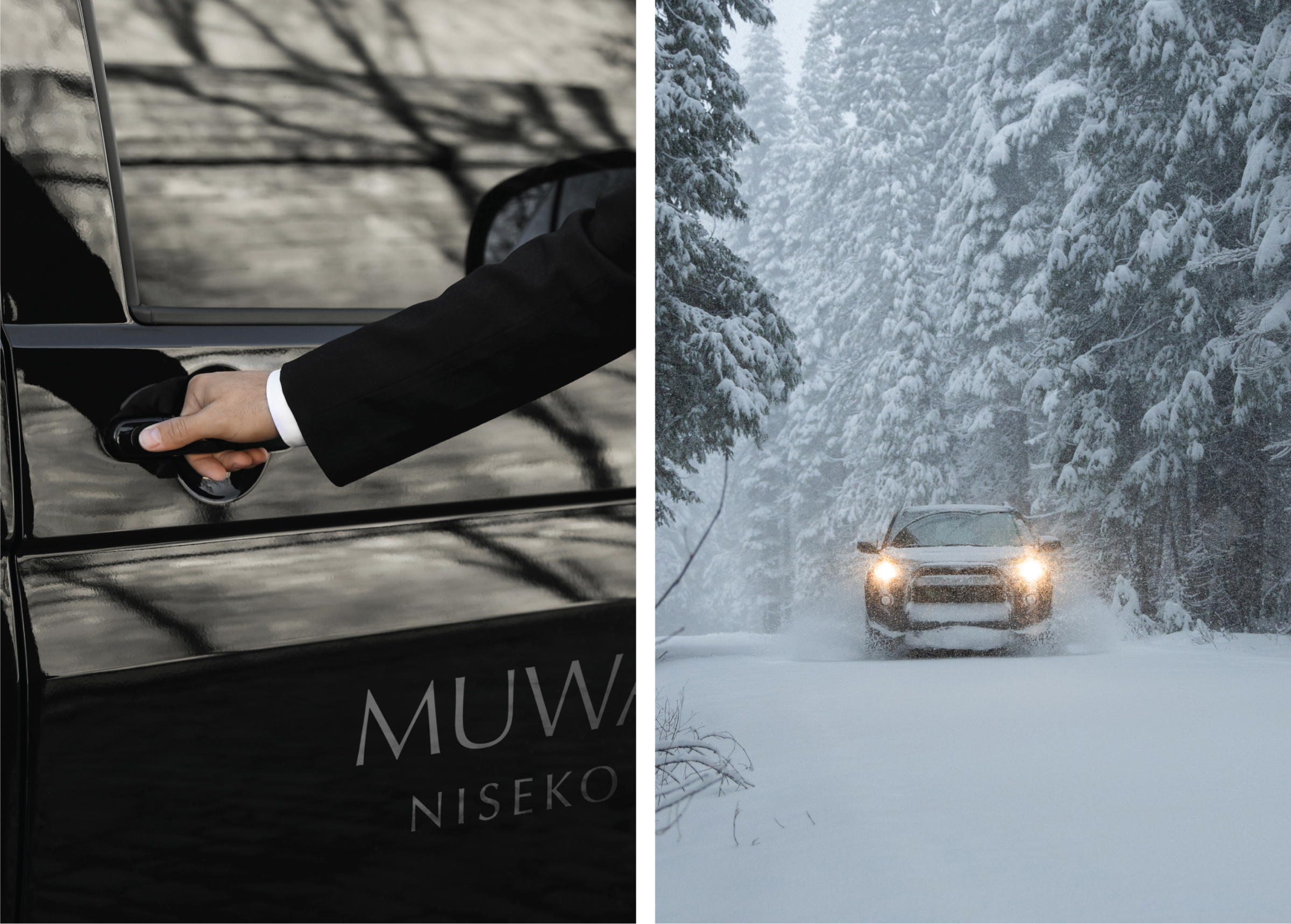
Location
- Seoul
- Hokkaido
Project Team
- Sang Mun
- Beencent Oh
- Jungeun Shin
- Doyeon Yang
- Dasol Kim
- Minhyeok Lim
- Hyeryhn Park
Collaborators
- Studio Dosi
- Sungwoo Hong
Deliverables
- Brand Strategy
- Brand Identity
- Digital Experience
- Motion Design
- Typeface Design
- Editorial Design
- Merchandise
- Packaging
- Signage & Environment
The brand name MUWA is from the French word ‘MOI [mwa]’, which means ‘me’, ‘myself’,
and it is written phonetically in English. The name is meant to convey that the place
where one resides is personal, reflecting the individual's uniqueness and character.
and it is written phonetically in English. The name is meant to convey that the place
where one resides is personal, reflecting the individual's uniqueness and character.
OTHER WORKS